Opportunity: At the conclusion of the final semester in my undergrad, my cohort was given an opportunity to produce the branding for the senior art and design exhibition.
Solution: Myself and four other designers teamed up and produced a strong visual direction. As we reflected on the past four years, we realized that each student has had a defining moment where a spark ignited and everything changed. Whether it was a conversation with a professor, a topic in art history class, or a unique project, each student experienced the impact of a cataylst moment. Therefore, we decided to name the art and design exhibition "Catalyst".
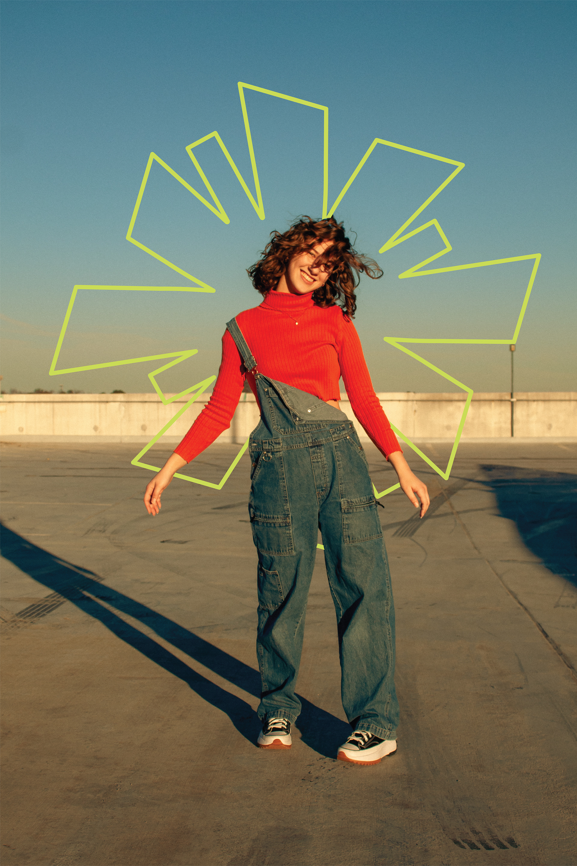
We aimed to design a brand identity system with 4 main descriptors: inclusive, evolving, momentous, and energetic. We chose an orange, green, purple, and blue color scheme because of it's energy and unique pairing. Additionally, we selected the typography based on the bespoke wordmark which is a modified version of Big Shoulders Display. Lastly, we created a burst mark which is an abstract representation of a catalyst moment.
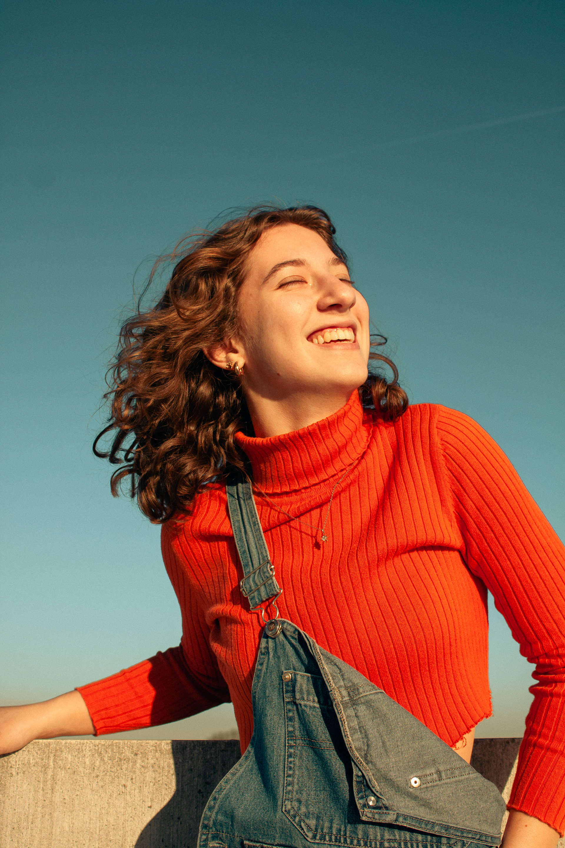
While I contributed to the visual direction and overall branding of the project, I had the unique opportunity to direct and shoot the photography direction. My goal was to create images that were both vibrant and nostalgic. I aimed to mimic to the look and feel of color film, especially in relation to the color grading. I chose to shoot at an urban environment that is central to the heart of downtown Anderson, SC.


